Monday, March 8, 2021

Microsoft Power BI Measures

    Power BI desktop offers a wide range of functionalities to create reports and insights into data easily. But still, there might be some areas or points in a report where we feel that we cannot represent what we want with the data that we have. For such cases, we can create our own measures in Power BI.

    Usually, measures are used in aggregation calculations such as sum, average, minimum value, maximum value, counts or more advanced level calculations made using DAX formula. So, in other words, measures are like formulas that are calculated. Then it produces a result specific to the purpose and values it is used for.

Get data from multiple sources!

Power BI supports large range of data sources.

You can click Get data and it shows you all the available data connections. 
It allows you to connect to different flat files, SQL database, and Azure cloud or even web platforms such as Facebook, Google Analytics, and Salesforce objects.


    In this article, I will be importing various film tables and create an film report. The data to be imported includes two CSV file and one Excel file.


Let's get started...

    Create a Power BI report by loading data from Excel and CSV file using Get Data connection.
    
    Once the data is loaded, lets move to Model view to manage the relationship between the three tables.

    The three tables are Genres, Films and Director. Within which Films table is the master table here.

    Now, to represent well let's rename the fields in field pane by right clicking the column.


    Going to report view, let's create three table visual :
  1. Listing out Directors
  2. Listing out Genres
  3. List out the films made by Director with Genres.
    So, first table will include Director and Gender as values.
    As formatting part, title is added to this table as Directors and background color is given for it as well using Format pane.

    Second table includes all genres as the value. And title is also added to this table as Genres using Format pane with background color.

    Third and last table includes all the Director name from Director table, Genres from Genre table and Title from Films table.

By selecting Akira Kurosawa from Director table, all the films directed by this particular director with its respective genres were listed.


Saving the report as Go Akira.pbix , sounds fun!!! 😀


Matrix Chart based on SQL Server Database

 Power BI Matrix chart also called as Cross tab, is useful to display relationship between two or more than two groups.


    In this article I will be creating a Matrix chart by using SQL Server database as the data source.

To start with it, I created a new Power BI file first and then executed the SQL script in SQL Server.

Once the query is executed in SQL server, come back to Power BI desktop and connect Power BI to SQL Server by using Get data option.

There are multiple tables loaded but I need only selective tables to be added in Power BI to create report.

So I chose four tables and loaded 
  • tblCentre
  • tblPurchase
  • tblRegion
  • tblTown        
Now all the four tables with their variables are shown under field pane. 
To create the required Matrix Chart, I selected the chart from Visualization pane and a blank Matrix was displayed on canvas.

RegionName from Region table was added under Rows section, Quantity from Purchase table was added to values and PurchaseDate from Purchase table was added under Column section.

Since Quantity was summarized to SUM in values and I needed the average so made changed SUM to AVERAGE.

The chart is formed, now the formatting part is required.

Changed the font size and background color of Column headers and Row headers under Format pane.

Also added title to the Matrix named as Quantity sold by Quarter.

The year in Row header was drilled down to Quarter to get deep analysis.

Saving the file by name 'That was easy.pbix'.


Manage Relationship in Power BI

Relationships between the tables are necessary to accurately calculate results and display the correct information in your report.


Power BI Desktop makes creating those relationships easy.


Let's create a relationship between four tables imported from an Excel file using Get Data.

The WorldEvents.xlsx file includes Events, Category, Country and Continent tables.

Initially, I loaded only three tables viz. Events, Category and Country to the Power BI Desktop.

As, Power BI attempts to find and create relationship for us, I selected Home > Manage Relationship > Autodetect.

But then it was showing as 'There are no relationships defined yet.'

So again selected Home > Manage Relationship > New.

In the Create Relationship dialog box, in the first table drop down box, i selected the first table Country and selected the column Country ID.

In the second table drop down box, i selected the table Event and selected the column EventCountry ID and clicked OK.

First relationship is done!!

    By default Power BI automatically configures the options Cardinality, Cross filtration and makes this relationship active.

Now, let's do the same for creating second relationship between the table Event and Category by connecting EventCategory ID and Category ID.

Next, I wanted to add the forth table to Power BI desktop and manage its relationship too.

It can be done very easily by selecting recent sources on the Home tab and adding the Continent table from the same excel sheet used before.

As the forth table is imported, it's time to create a join between Country table and Continent table, same by selecting ContinentID from first table and ContinentID from second table.

The relationships for the all the tables are created which will help report generation.

Saving the file with Creating Cultural Connection.pbix name.


Tabular Visualisation - Microsoft Power BI

     A table visualization in Power BI is a grid where the related data are displayed in rows and columns.

    Tables are great quantitative comparisons where you compare multiple values from different categories.

I will create another Tabular Visualization in Power BI Desktop for FTSE 100 shares and for more interesting look will be adding an image with it.

Let's get started by loading the data by connecting Get Data and selection the option Excel to import data from FTSE data.xlsx . 

The preview of the data is shown and by selecting the load button the data will be loaded within few seconds.

The field pane contains the variables of the data.

I located the table chart from visualization pane to the canvas and by clicking on the chart it will create a default table in the canvas.

Since nothing is displayed in the table, i selected the required columns from the field pane.

Name and current price were the two columns to be added into the table, hence selected the same from field pane.

The total for all current price is automatically shown in the table.

Formatting Table

Now the table is ready, but it requires small formatting. There are few formatting options in Power BI and for this table i have explored some of them.

Started by adding title to the table as FTSE 100 and aligning it to centre and increasing font size to 22, font color to #FFFFFF and background color to #094780.

Next, I made changes in column header of the table, by changing the font size to 14 and adding background color for it.

Also did the same changes to the values in the table.

This made the table look more attractive.

Adding Image & shape

The image to be added in canvas has to be stored in local drive.

Selecting the insert option from the ribbon, I added an image to the left centre of the table.

To add a border to that image, I selected border settings from format pane and aligned the image properly in centre of the box.

Next i added an arrow shape pointing towards the table in between the image and the table visual.

The arrow was also inserted from the Insert ribbon.

The shape was formatted by adding color to the shape and adjusting the size in format pane.

Finally, the report was completed and saved as Footsie.pbix


Microsoft Power BI's Matrix Visualization

    Sometimes table visualization is not sufficient, and we need to add more granularity to the chart. This is where Matrix Chart Visualization becomes helpful.

Similar to table visual, Matrix chart can be found under Visualization pane.

    Let's get started and try using Matrix Chart Visualization to show the count of Films by Certificate rating and Genre.

I will start by loading the data from excel file named as Age Specific Genres.xlsx to Power BI desktop.

Clicking on Get data, I selected Excel for the data source option and the data was loaded.

Once loaded, the Field pane contains the variables of data.

Selected Matrix chart under Visualization pane and it created a blank chart on the canvas.

Nothing is displayed yet because I have not added the required columns into the chart.

Under the Field pane, I dragged Genre into Rows, Certificate into Columns and Title into values, which by default was showing as Count of Title.

    Coming to the Formatting Options...

The next step I started with was formatting the Matrix Chart.

I started with the column headers under the Format Pane.
    Increased the font size and changed font color of the headers. Set font size to 16 and changed header color to #068A32.

Next I changed the size of Row headers.
    Under Row headers, I had set the text size to 16 and changed the header color to #068A32.

Now, I completed the formatting for headers, but the same has to be done for the values also.
So I made use of Values option to make the changes as required. Changed the text size to 16.

Font size and color changes were also done for Grand total & Sub total.

    Lets add the image to make the report more interesting

To insert an image to Power BI Desktop, the image must be stored in our Local drive. 

I clicked on Insert ribbon and selected the Image option within it.

Immediately the image was appeared on the canvas.

I have saved this file with the name "Still a better matrix than reloaded.pbix"

And the report looked this way as required :


Microsoft Power BI's Table Visualization

 You don’t have to labor for hours to design charts and graphs in your reports. By using the intuitive Power BI tools, you can use drag-and-drop gestures to create stunning visual reports in a few minutes.

Power BI Tables are a great choice:

  • To view and compare detailed data and exact values (instead of visual representations).

  • To display data in a tabular format.

  • To display numerical data by categories.

These visuals can be created and viewed in both Power BI desktop and Power BI service. 

The steps and illustrations in this article are from Power BI Desktop.

Let's Go! 😃

Considering the example for listing out the 1000 best film.

Started by loading a dataset to Power BI Desktop.

Used the Get Data menu to connect to a dataset from a file, database, or online source. Here, I will be connecting to Excel data List of Films.xlsx


The preview of the data is shown, and once I was satisfied that I am loading the right file, clicked Load.


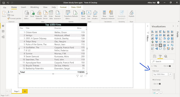
I have loaded the file, and saved as Citizen bloody Kane again. The Fields pane contains the variables of the data.


Now, I selected the table chart in the Visualization pane, and it created a default table in the canvas. Nothing is displayed yet because I have to add the required columns in the table.


The next step is to fill the arguments under the Values option. The columns required in the table were Pos, Title, Director, Mins. 
So, I clicked on the table visualization and selected the respected columns from the field pane and it was automatically added to the values option and table.


The required table with 1000 top films is ready.

Now lets make it look more clean and stylish. 😉 

So I customized the table changing column header's and value's font size, adding title for the table, changing the background and font color for Subtotal values and title using Format in Visualization Pane.


By adding and customizing the title, the table looked somewhat like this:


Next, I changed the color of Total label and value from the Format pane.


So, as per the requirement, now the films are sorted by Positions and the table has a title and totals.

Microsoft Power BI

Microsoft Power BI Measures

    Power BI desktop offers a wide range of functionalities to create reports and insights into data easily. But still, there might be some ...